The Basics of Guntastic
- Posted by Francesco
- 5 Min. read
- 0 Comments
In a previous post we went over some of the design decisions that need to be tackled when first starting out a pixel art platformer. In particular, we went over the importance of defining a reference grid, and what are the gameplay implications of choosing a certain native resolution. In this post we’re going to take a look at how we approached these decisions in our upcoming game, Guntastic.
What’s Guntastic About Anyway?
While brainstorming the game we knew we wanted to create an over-the-top, one-shot one-kill multiplayer shooter that could be played on a single screen, shared between all the players to support ruthless living room competitions.
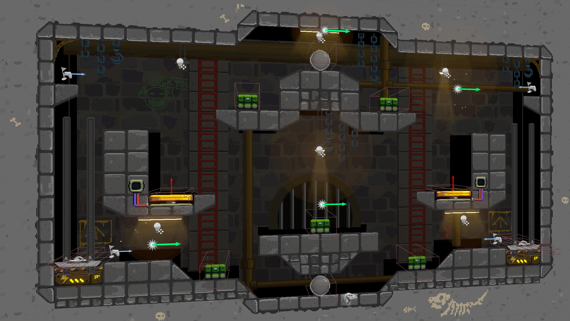
We wanted the game to feature levels loaded with weapons and powerups, as well as dynamic elements (such as jump-pads, lifts, traps and so on) that created spectacular ways to frag opponents. We also wanted it to be simple enough for newcomers to immediately get some fun out-of-it, yet elaborate enough to entertain seasoned players.
Gameplay First
That doesn’t sound like a complex idea, does it? Still, it’s already enough to set multiple requirements that need to be carefully taken into consideration:
- Since the game revolves around multiplayer shoot-outs, players need to always be aware of what’s going around them: where adversaries are, which weapons are available, etc. This means the whole level should be visible, all the time.
- Yet, everything should fit on a single screen, where there should be enough room for four players that need to move, shoot, jump and so on.
- Levels should also be somewhat elaborate in order to accommodate multiple pickups, dynamic elements and fancy gameplay. Big, empty, boring rooms are out of question.
- Visual clarity should be king: the game should feel clear and predictable. This is not only important to make it more approachable for new players, but it’s also required in order to support advanced gameplay dynamics for expert players.
Choosing a Native Resolution
As we’ve seen in a previous post, the size of the playable area in a pixel art game is limited by its native resolution. Since we needed as much room as we could afford for our levels, we immediately went for a 16∶9 aspect ratio: this gave us some extra pixels to work with, and is also what players seem to expect nowadays anyway.
Modern pixel art games that use a 16∶9 aspect ratio tend to be drawn on a 640×360 canvas, so we went with that too. We’ll talk about why this is considered to be one of the best native resolutions in a future post, so for the moment just trust me on this one.
Defining The Grid
Finding out the correct tile size required some more time and experimentation. Beyond gameplay considerations, we also needed to deal with the fact that none-of-us had any previous experience with pixel art whatsoever, and none-of-us could afford to work on art full-time. Being only two people means you’re forced to wear a lot of different hats to make things work.
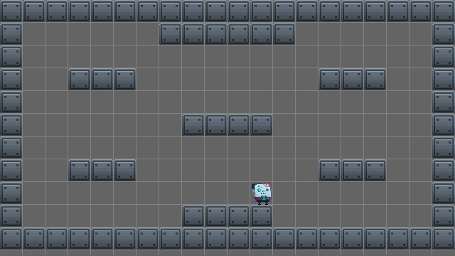
16×16: Too Small

- Visible area: 40×22.5 tiles.
- Pros: a lot of horizontal and vertical space. Low-res graphics is easier to draw. Allows for characters that are taller than wider (the default in most games).
- Cons: everything is so small that it’s difficult to know what’s what, seriously impacting visual clarity. Graphics is too low-res for what we had in mind.
32×32: Too Large
- Visible area: 20×11.5 tiles.
- Pros: higher resolution graphics.
- Cons: too few tiles create insufficient horizontal and vertical space. Art resolution is too high.
24×24: We Have a Winner!

- Visible area: 26.666…×15 tiles.
- Pros: medium-res graphics, solidly within our grasp. Enough horizontal and vertical space for slightly complex levels provided that…
- Cons: …we keep characters a tile wide and tall, not more. This means to enforce additional constraints on the design of the characters.
While not so common as people tend to prefer power-of-two grids, this was a tradeoff that worked well for us. It was simple enough to draw, yet allowed for additional details over 16×16 tiles, but more importantly gave us some more space to work with over a 32×32 grid. 24×24 tiles also proved to work well when dealing with multiple screen resolutions as they allowed for a safe zone at the margins of the screen. We’re going to talk about this in detail in a future post.

The Bottom Line
There’s no right native resolution and grid size when it comes to pixel art games: experimentation around gameplay and art constraints is the only way to find out what works best.