Page 7 of 8
Anatomy of a Character
- Posted by Francesco
- 7 Min. read
- 0 Comments
A couple of weeks ago we introduced our fifth character in Guntastic, so I thought it might be a good time to talk about our character creation workflow, from the concept stage to the actual implementation in Unreal Engine 4.

Introducing a new character in #Guntastic: say hello to the Demonic Koala! #screenshotsaturday #indiedev #gamedev #pixelart #ue4
PS: maybe we've been playing a bit too much Dragon Ball FighterZ lately... pic.twitter.com/mHuvTnQvtI— Ludicrous Games (@weareludicrous) June 30, 2018
In The Beginning…
The process begins with our artist Simone doing some quick sketches of different characters, from which we usually pick the one we like the most.

He then iterates on the design until we have something we like. Otherwise we drop a tear, throw everything away and start over.
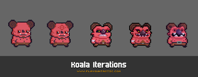
Once the character design is final, he then proceeds to create all the required animations. It’s important for the design to be as refined as possible at this stage: altering it afterwards requires massive time as it involves editing all the animations frames one by one (a character currently has 162 unique animation frames – and counting!).
Although I tried to make him do the jump to a pixel-art drawing software (such as Pro Motion NG or Pyxel Edit), he stubbornly continued to use Photoshop for all the editing. This required some technical setup to allow for quick iteration times: each animation frame is on a separate layer, which is linked to a keyframe in the timeline for easy previewing. Each PSD usually contains multiple characters so that it’s easy to use previously created characters as blueprints for a new one.

From Photoshop To UE4
Exporting all the frames by hand would be madness, so we have a custom Photoshop script that automates the export process and generates a single PNG file out of each animation frame. Automating error-prone and repetitive tasks is invaluable for the overall workflow, especially for small teams with no fancy QA department. 😃 Our export script also helps us maintaining a strong nomenclature, which is invaluable to avoid the risk of going insane tracking errors, duplicated sprites, etc.
We then use Texture Packer to compress all the frames in a single texture atlas. If you do any 2D game development and don’t know about Texture Packer, you really need to check it out: it’s a nifty utility that packs multiple sprites into a single file (A.K.A. atlas, or spritesheet). This not only helps lowering texture memory usage, but also keeps the assets tidily organized - which soon becomes a necessity when you have to deal with large amounts of sprites. Texture Packer also works from the command line, so this step can be automated as well. At the moment we have a single atlas per-character.

The next step is (re)importing the atlas into the engine. We started out using Paper2D (that, for the uninitiated, is the 2D framework available by default in Unreal Engine 4), but slowly transitioned to a custom solution over time. This allowed us to have far more control over both the import process and the rendering of sprites and flipbooks (right now we use Paper2D only for editing and rendering tilemaps).
Once the atlas is imported we end up with multiple folders containing the sprites and flipbooks ready to use. To keep the amount of manual editing to a minimum, the system is also fed with spreadsheets containing useful defaults that are automatically applied to the sprites and flipbooks (such as frame rate, etc.). Additional animation assets are also generated in this step, which are used by our animation system to actually play the animations – more on this later.

Character Setup
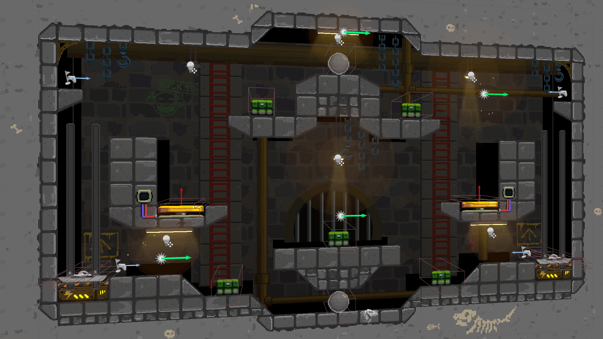
Before digging into the actual animation system, lets briefly talk about how our characters are setup. In Guntastic a player can run, jump, shoot, fall, etc. – all at the same time. What’s more, a player can also aim at different direction while performing any of the aforementioned movements. We also have different weapon types, such as pistols and rifles, that require different character stances. Moreover, some animations such as jump, land and firing are one-shots rather than loops.
While prototyping the game, we soon found out that having full body animations for every permutation of the different actions a player can perform would soon make the animation count skyrocket, out of reach for the hands of only two developers. After some tinkering we ended up splitting the character into two different sprites: one for the lower body (legs, feet), and one for the upper body (torso, head, arms). This is similar to what’s usually done for 3D characters and allowed us to seamlessly play multiple animations on different parts of the body at the same time: for example we can have a walk animation playing on the legs, while a firing animation is playing on the torso.

The Animation System
Our animation system is implemented in C++ in our custom Character class and works by using the descriptor assets that were generated during the import process. These hold references to different flipbooks, each representing a different movement state (i.e. idle, walking, etc.), a different weapon stance (i.e. pistol, rifle, etc.) or a different aim offset (i.e. forward, up, down). The system then sorts out which flipbook to use on the lower and upper body sprites based on the current character state.
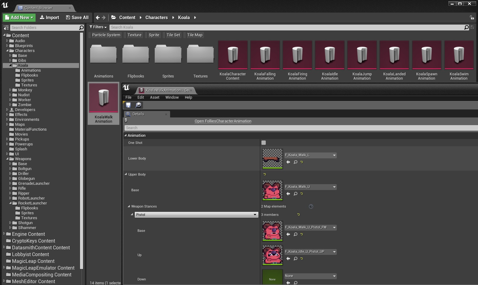
We also apply some modifiers to the animations: for example, the walk cycle is played faster or slower based on the current movement speed of the character. The whole system was kept intentionally simple (~150 lines of code) by enforcing constraints on the animations, which also make authoring them simpler. For example, all animations runs at framerates that are whole divisor of 24 FPS (i.e. 12, 6, etc.) to easily sync them.
Wish List
While the whole system works quite well, there’s still large room for improvements (as it’s always the case in game development!). Something I would have liked to have the time to work on was a UE4 editor extension that would import the animation frames directly from the PSD files. The extension would then take care of packaging the frames into texture atlases automatically, thus eliminating the need for external utilities and scripts.
Something I also would have loved to implement was a visual, state-machine-based animation system for flipbooks – similar to what Unreal Engine 4 provides out-of-the-box for skeletal meshes. While presumably less performant than the current hard-coded C++ solution (but then again, performances are rarely an issue in modern 2D games!) it would have helped tremendously during the prototyping phase. Maybe for the next game! 😉
Pixel Sharp Graphics at Multiple Screen Resolutions
- Posted by Francesco
- 9 Min. read
- 0 Comments
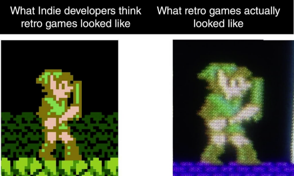
Pixel art can be very picky when it comes to being scaled as it easily loses its pixel-perfect look, becoming blurry and distorted. This creates an interesting technical challenge for pixel art games since they are drawn at a fixed native resolution, but need to adapt to a wide variety of screen resolutions and aspect ratios.

A Modern Problem
The old gaming consoles – where pixel art was born – would always output video data at only one resolution, regardless of the CRT monitors and TVs they were plugged to. This inevitably led to distorted and blurred graphics, which were made worse by the artefacts generated by the way cathode tubes and video standards worked. At the end of the day, what players saw on the screen looked nothing like the original pixel art and developers could do nothing about it.
Yet today most players expect pixel art to look crisp and sharp regardless of whether they’re using the latest 4K OLED TV or an old 4∶3 LCD screen. In this post we’re going to take a look at how we handled this problem in Guntastic.
Assessing the Situation
During pre-production we investigated which screen resolutions players actually used to get a better idea of the problem scale. While it was quite safe to assume home consoles worked at standard 16∶9 resolutions such as 720p and 1080p (and now 2160p), the situation on PC was far more complex:
| Screen Resolution | Aspect Ratio | Adoption |
|---|---|---|
| 1920×1080 (FHD) | 16∶9 | 38.21% |
| 1366×768 (WXGA) | ∼16∶9 | 24.76% |
| 1600×900 | 16∶9 | 6.05% |
| 1440×900 | 16∶10 | 4.59% |
| 1536×864 | 16∶9 | 4.48% |
| 1280×1024 (SXGA) | 4∶3 | 4.08% |
| 1680×1050 | 16∶10 | 3.62% |
| 1360×768 | ∼16∶9 | 2.89% |
By looking at the data above we observed that:
- Perhaps unsurprisingly 16∶9 was the more common aspect ratio, with the standard 1920×1080 resolution which was used on more than 38% of PCs (with Steam installed, that’s it).
- There are some awkward screen resolutions out there, with queer 16∶9-like aspect ratios, or perfect 16∶9 aspect ratios but uneven sizes.
- More than 7% of users had 16∶10 screens.
- Screens with a 4∶3 aspect ratio still existed, although had a shrinking a small market share.
Remember, the data above is from December 2016. Had we started working on the game today, we would have found a radically different scenario: 1080p is used on more than 60% of PCs, while non-HD resolutions (which were predominantly used on laptops) and 4∶3 screens have declined sharply.
A Starting Point
As standard 16∶9 HD resolutions were already the de-facto target to develop for, we decided to use a reference resolution of 640×360 pixels. A canvas of this size scales perfectly using integer factors to all HD resolutions: 2× for 1280×720, 3× for 1920×1080 and so on, including 4K, 8K and possibly more (although I can’t imagine what a pixel art game would look on such screens!). We’ve already seen in a previous post that 640×360 proved to be the most viable option from a gameplay point of view as well.
Our initial implementation of the scaling mechanism was quite standard, and worked by changing the orthographic size of the game camera based on the detected screen resolution. A very good introduction to this technique can be found in the Pixel Perfect 2D post on the Unity blog, which also provides example code that can be easily ported over to UE4.
Thick Borders to the Rescue
To prevent distortions and blurriness at the remaining screen resolutions we identified a simple solution in a slightly modified version of the “Thick Borders” technique outlined in the same blog post.
Basically, the idea is to scale the game to the nearest whole multiple of the reference resolution and then show or hide a small portion of the game world to the sides of the screen to compensate for the small difference in screen resolution. This proved to work well especially on 16∶9-like aspect ratios displays that have resolutions that only differs marginally from standard 16∶9 HD resolutions (e.g. 1366×768, 1360×768, etc.).
To support this technique we had to change how the final scaling factor is calculated: if it’s near to the next integer, we round it up, even if we’ll lose a bit of the world to the sides; otherwise we round it down, so thick borders will fill the rest of the screen. The final implementation lives inside our PlayerCameraManager class and takes approximately 80 lines of code. A simplified version is presented below:
// The native resolution of the pixel art
const FVector2D ReferenceResolution(640.0f, 360.0f);

// The pixels per unit (translation factor from pixels to world units, in our case 24px (a tile) = 100cm)
const float ReferencePixelsPerUnit = 0.24f;

void AFolliesPlayerCameraManager::UpdateCameraWidth(FMinimalViewInfo& OutCameraView)
{
    if (GEngine == nullptr)
    {
        return;
    }

    const UGameViewportClient* GameViewport = GEngine->GameViewportForWorld(GetWorld());
    if (GameViewport != nullptr && GameViewport->Viewport != nullptr)
    {
        // Get the viewport size
        const FVector2D ViewportSize(GameViewport->Viewport->GetSizeXY());

        // Calculate the new orthographic width based on pixel art scale and viewport size
        OutCameraView.OrthoWidth = (ViewportSize.X / ReferencePixelsPerUnit) / GetPixelArtScale(ViewportSize);
    }
}

float AFolliesPlayerCameraManager::GetPixelArtScale(const FVector2D& InViewportSize)
{
    // Calculate the new art scale factor
    float BasePixelArtScale = (InViewportSize.X / ReferenceResolution.X);

    // Round it up or down
    BasePixelArtScale = (FMath::Frac(BasePixelArtScale) > 0.9f) ? FMath::CeilToFloat(BasePixelArtScale) : FMath::FloorToFloat(BasePixelArtScale);

    // In the extremely rare case where the display resolution is lower than the reference resolution we
    // also need to protect against divisions by zero, although in this case the game will be unplayable :)
    BasePixelArtScale = FMath::Max(1.0f, BasePixelArtScale);

    return BasePixelArtScale;
}
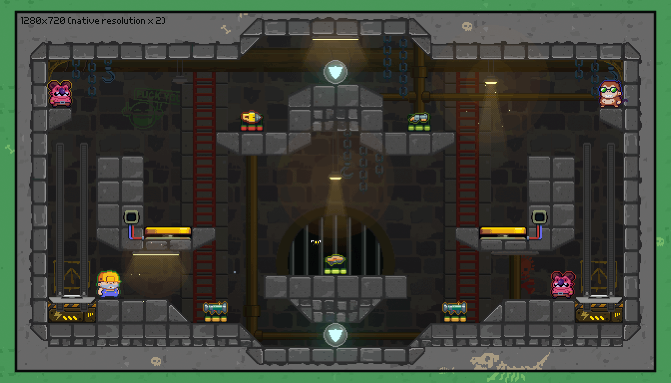
While thick borders won’t work well for some games since they would inevitably affect gameplay by changing the portion of the world that is visible to the player, they worked quite well for us. In Guntastic every level need to be completely self-contained to fit on a single screen, and having additional room to spare to the sides even gave us a chance to fill these areas with additional details. As an additional precaution, we also established a safe area of one tile around every level that can be hidden, without affecting gameplay, in the very rare cases where the scaling factor is rounded up instead of down.
Handling Out of Gauge Screens: Letterboxing
Although thick borders did the trick in most cases, they failed to handle situations where the area to cover to the sides was way too big, in example with some 4∶3 screens and uneven resolutions such as 1600×900. Since these screens were not widespread we decided to solve the problem by applying a simple letterboxing effect. This also served as a failsafe solution in case a player is using a very strange resolution we didn’t directly account for.

We initially tried to apply the letterboxing effect through the built-in vignette post processing filter, but it proved difficult to control and integrated badly with the pixelated look of the rest of the game. Currently, the effect is implemented inside the game world by using a simple rectangular static mesh, with a big central hole that helps keeping overdraw to a minimum. Not the cleanest approach, but it gets the job done!
The Final Result
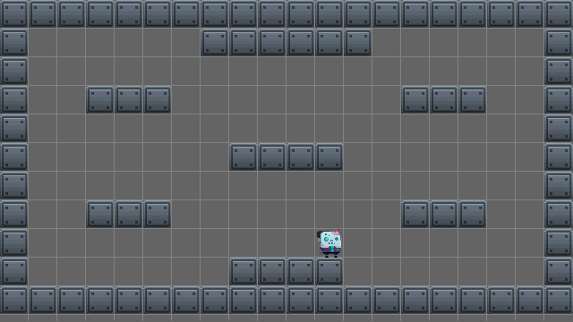
In the end, every level in Guntastic is composed of 34×24 tiles. The playable area only accounts for 24×16 of them (which is approximately our native resolution of 640×360 pixels), with the rest being there only to support the thick borders and letterboxing techniques. The following table and figure show which scaling factor and techniques are applied at common resolutions:
| Screen Resolution | Scaling Factor | Visible Techniques |
|---|---|---|
| 1920×1080 (FHD) | 3 | None |
| 1366×768 (WXGA) | 2.1 ⇒ 2 | Thick Borders |
| 1600×900 | 2.5 ⇒ 2 | Thick Borders, Letterboxing |
| 1440×900 | 2.3 ⇒ 2 | Thick Borders, Letterboxing |
| 1536×864 | 2.4 ⇒ 2 | Thick Borders, Letterboxing |
| 1280×1024 (SXGA) | 2 | Thick Borders, Letterboxing |
| 1680×1050 | 2.6 ⇒ 2 | Thick Borders, Letterboxing |
| 1360×768 | 2.1 ⇒ 2 | Thick Borders |

- Green: 1× scaling factor.
- Blue: 2× scaling factor.
- Yellow: 3× scaling factor.
Conclusion
In this post I presented the solution we adopted to support multiple screen resolutions in Guntastic, which is a mix of three different techniques: scaling, thick borders and letterboxing. While definitely not perfect, this approach was quite simple to implement while remaining – we hope – future proof and flexible enough to handle even niche resolutions.
The Basics of Guntastic
- Posted by Francesco
- 5 Min. read
- 0 Comments
In a previous post we went over some of the design decisions that need to be tackled when first starting out a pixel art platformer. In particular, we went over the importance of defining a reference grid, and what are the gameplay implications of choosing a certain native resolution. In this post we’re going to take a look at how we approached these decisions in our upcoming game, Guntastic.
What’s Guntastic About Anyway?
While brainstorming the game we knew we wanted to create an over-the-top, one-shot one-kill multiplayer shooter that could be played on a single screen, shared between all the players to support ruthless living room competitions.
We wanted the game to feature levels loaded with weapons and powerups, as well as dynamic elements (such as jump-pads, lifts, traps and so on) that created spectacular ways to frag opponents. We also wanted it to be simple enough for newcomers to immediately get some fun out-of-it, yet elaborate enough to entertain seasoned players.
Gameplay First
That doesn’t sound like a complex idea, does it? Still, it’s already enough to set multiple requirements that need to be carefully taken into consideration:
- Since the game revolves around multiplayer shoot-outs, players need to always be aware of what’s going around them: where adversaries are, which weapons are available, etc. This means the whole level should be visible, all the time.
- Yet, everything should fit on a single screen, where there should be enough room for four players that need to move, shoot, jump and so on.
- Levels should also be somewhat elaborate in order to accommodate multiple pickups, dynamic elements and fancy gameplay. Big, empty, boring rooms are out of question.
- Visual clarity should be king: the game should feel clear and predictable. This is not only important to make it more approachable for new players, but it’s also required in order to support advanced gameplay dynamics for expert players.
Choosing a Native Resolution
As we’ve seen in a previous post, the size of the playable area in a pixel art game is limited by its native resolution. Since we needed as much room as we could afford for our levels, we immediately went for a 16∶9 aspect ratio: this gave us some extra pixels to work with, and is also what players seem to expect nowadays anyway.
Modern pixel art games that use a 16∶9 aspect ratio tend to be drawn on a 640×360 canvas, so we went with that too. We’ll talk about why this is considered to be one of the best native resolutions in a future post, so for the moment just trust me on this one.
Defining The Grid
Finding out the correct tile size required some more time and experimentation. Beyond gameplay considerations, we also needed to deal with the fact that none-of-us had any previous experience with pixel art whatsoever, and none-of-us could afford to work on art full-time. Being only two people means you’re forced to wear a lot of different hats to make things work.
16×16: Too Small

- Visible area: 40×22.5 tiles.
- Pros: a lot of horizontal and vertical space. Low-res graphics is easier to draw. Allows for characters that are taller than wider (the default in most games).
- Cons: everything is so small that it’s difficult to know what’s what, seriously impacting visual clarity. Graphics is too low-res for what we had in mind.
32×32: Too Large
- Visible area: 20×11.5 tiles.
- Pros: higher resolution graphics.
- Cons: too few tiles create insufficient horizontal and vertical space. Art resolution is too high.
24×24: We Have a Winner!

- Visible area: 26.666…×15 tiles.
- Pros: medium-res graphics, solidly within our grasp. Enough horizontal and vertical space for slightly complex levels provided that…
- Cons: …we keep characters a tile wide and tall, not more. This means to enforce additional constraints on the design of the characters.
While not so common as people tend to prefer power-of-two grids, this was a tradeoff that worked well for us. It was simple enough to draw, yet allowed for additional details over 16×16 tiles, but more importantly gave us some more space to work with over a 32×32 grid. 24×24 tiles also proved to work well when dealing with multiple screen resolutions as they allowed for a safe zone at the margins of the screen. We’re going to talk about this in detail in a future post.

The Bottom Line
There’s no right native resolution and grid size when it comes to pixel art games: experimentation around gameplay and art constraints is the only way to find out what works best.