Page 6 of 8
Devlog #1 - Meet Mr. Poopypants
- Posted by Francesco
- 3 Min. read
- 0 Comments
As we step up the pace towards finally releasing Guntastic in Early Access later this summer, we’d like to start sharing more insights into the actual development (better late than never right? 😄). Our goal is to write these kind of posts on a biweekly (in the fortnightly sense) basis or so. These will include things we’ve been working on during our internal dev sprints. So, lets get started!
Things has been moving slowly over the past few weeks due to one half of the team (that is, me! 😃) being on a short annual leave. Nonetheless, we got some cool things to share.
Meet Mr. Poopypants!
First of all meet our latest playable character:
The concept for this character was born as an inside joke, but, the more we talked about him, the more he fit with our long-term goal of creating as many different designs as possible. Hope you like how he turned out!
Color Tinted Character Variations
One of the most popular request we got while showcasing the game at events was to make characters more easily distinguishable, especially in situations where two (or even more!) players choose the same character. We already had some hints in place: weapons and projectiles, for example, were already tinted of the player’s primary color (i.e. red for Player 1, green for Player 2 and so on). Characters also already featured a tinted outline. Listening to your feedback, we took things a step forward and also tinted the characters themselves!
Additional Changes
Support for Private (Invite-Based) Games
This has been on my to-do list for a long while. Private games are now fully working, including receiving and accepting invites through Steam.
Improved handling of network errors
No one likes getting disconnected from the server while a game is in progress, but things happen. In preparation for releasing the game we worked on gracefully handling the most common errors, with visual notifications popping up on the player’s screen (UI still a work in progress!).
That’s it for today, see you in a couple of weeks! Don’t forget to join us on Discord to stay up-to-date with the latest news. 😃
Anatomy of a Level
- Posted by Francesco
- 10 Min. read
- 0 Comments
Over the past few months we spent quite some time iterating on levels in preparation for Early Access. Most of them now feature improved graphics, a dedicated music track and countless gameplay improvements. But how does a level in Guntastic come to be?
YAY! This #screenshotsaturday is a #musicsaturday 🎧 with another taste of the WIP #Guntastic soundtrack! ▶ 🎵 🎶 #indiedev #gamedev #gamemusic #vgm #soundtrack #music #saturday pic.twitter.com/DiikTto2IM
— Ludicrous Games (@weareludicrous) June 8, 2019
The workflow we currently use is the result of our past work experience with 3D shooters and experimentation done in the early production phases of Guntastic. If you’re only interested in the actual workflow, feel free to jump to the final section of the post. Otherwise, read on.
In The Beginning…
When we first started working on Guntastic we didn’t know much about what the game was going to be, apart from the fact that it would be an arena shooter at its core. We decided to go this way in part because we love shooters and we believe that going indie should be about building the games we love (take this you cold, number-crunching business people!), but also because most of our past work experience involved building shooter games. With so many things that can go wrong while developing a game, we felt that a shooter was our safest bet (reality check!).
One of the fields in which we benefited the most from our background was level design as most of the guiding design principles for 3D levels can be applied to their two-dimensional counterparts. In particular:
- Gameplay and visuals should work in tandem. Always design for gameplay first, but having an idea of how the level should look like in the end makes the final result feel more natural.
- Using a modular approach based on grids and reusable assets makes it easy to think about, prototype and build levels. It also promotes visual clarity, aiding players navigating the world in an intuitive way.
- Each level should look and feel unique, both from a visual and gameplay point of view. Players are more likely to remember how to play a memorable level rather than an uninteresting one. (Plus, memorable usually means more fun at the design stage!)
Prototypes! Prototypes! Prototypes!
Guntastic, however, was still our first 2D game – and a very particular one. A whole level needs to fit on a single screen and have enough room to accommodate four players at the same time: two prerequisites that immediately enforce severe constraints on the level design. We also had character movement to sort out: how high could a player jump? Were there going to be special movements such as dodges or wall jumps in the game at all?

Since the best way to figure things out is through experimentation, we started creating rough level shells to play with. The following is the prototyping kit I originally put together in Photoshop back in 2016 and that we still use today to block out level shells. It includes tiles of various sizes and shapes that can be combined in a wide variety of ways. The idea of having half-tiles came a bit later, and proved crucial to deal with the very limited amount of space available on screen.

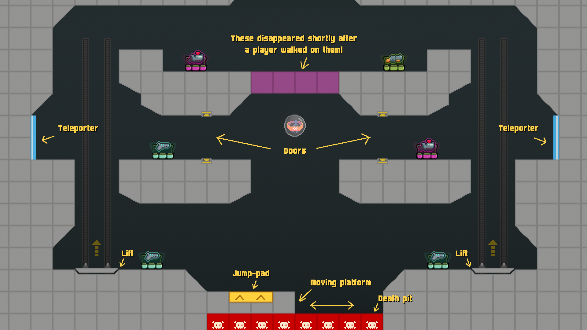
We spent several months iterating on an handful of levels as we tweaked the movement mechanics to our liking (more about this in an upcoming post). Dynamic environmental elements such as moving platforms, lifts, jump pads, areas with lower gravity, teleporters, destroyable elements, death pits, traps and more were gradually introduced into the mix. Working almost exclusively in Blueprints proved invaluable at this stage, enabling very fast iteration times (although most things were later moved to C++ for additional flexibility).
During this time we also started investigating the production of tile sets and environment pixel art. The first environment we envisioned was an underground sewer. While definitely not the fanciest way to start, it provided us with a good amount of artistical challenges in a small and controllable scope. It gave us a chance to practice with different materials, rounded shapes, backgrounds, lights, decorations and more and proved a great learning experience overall.

Of all the levels built during this stage, only two survived in the long run – with the rest being discarded because overly complex, difficult to navigate or simply boring to play.

Summing It Up
As we built new prototypes we found ourselves relying more and more on dynamic elements. Doors, jump pad, lifts and destroyable elements not only helped players move faster around the level and created unique gameplay opportunities by encouraging players to be creative with their surroundings, but also made levels far more unique and memorable. Some elements simply didn’t work and were cut. Moving platforms, for example, required way too much room to work, leaving no space for anything else. We also realized that having traps and death pits that killed players on touch (which counted as suicides, resulting in a one-point penalty) was frustrating and often left players wondering as to how and why they died and lost a point.
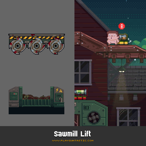
Another #screenshotsaturday, another environmental trap that can be activated to spectacularly frag your foes: the sawmill lift! 🌲🌲#Guntastic #gamedev #indiedev #UE4 #pixelart pic.twitter.com/BiUaJRaAJh
— Ludicrous Games (@weareludicrous) November 10, 2018
The turning point with environmental traps was the lift in what later became the Sawmill level. The lift needs to be activated by a player and has buzzsaws underneath that kill opponents on touch, rewarding the player who activated the lift with a point when that happens. This was a big paradigm shift. Players were now in charge of activating the traps found in the level and could actively exploit them to their advantage without risking penalties. This gradually pushed us into implementing dynamic elements that were more audacious, to the point that new levels could be built around a main dynamic element which also set the overall visual theme of the level.

The Actual Process
This brought us to the process we currently use to create levels. We first envision a strong dynamic environmental element and then block out the level around it. During this stage we search the internet for reference images and prepare mood boards to help later on in the process. The first sketches of both the layout and visuals are carried out using pen and paper. Things don’t need to look pretty at this stage (and in fact they don’t).


Once the layout looks promising we rebuild it inside the editor using the prototyping tileset. Dynamic elements are implemented at the same time. We test and iterate on the level until we’re satisfied about how it plays, changing the layout and the way dynamic elements work as we see fit. If we don’t like where things are going we simply throw everything away and start over.

The next step is what we call the mood pass. I take a screenshot of the final level layout (this is one of the few cases where having levels that fit on a single screen actually helps 😄) and do a paint over in either Photoshop or Pixel Edit blocking out the main foreground and background elements. Things don’t need to look pretty yet, but it’s important to discern what’s what. Special care is also put into making sure everything is tidily aligned to the grid. A base color palette is also defined at this stage to set the overall mood.

The level now pass on to Simone who uses the mood boards and additional references to perform the main visual pass.

Once the visual pass is complete, it’s my turn to break everything up in an easy-to-use tileset. This is important to rationalize the graphics and helps in case we need to do small adjustments to the layout later on (which we try to avoid, but things happen!). The level is then reassembled into the editor, where we add all the final bells and whistles such as lights, eye candy and visual effects.

The whole process usually takes a month from start to finish. Naturally, it isn’t always possible to follow this workflow to the letter, but the price paid in terms of additional strain and time needed to complete a level in those cases can be pretty high. Game development is a messy business! 😄
3 Tricks to Improve Pixel Art Rendering in UE4
- Posted by Francesco
- 6 Min. read
- 0 Comments
The pixelated look of the games of the past was largely the result of the severe constraints that graphics hardware imposed to developers back then. Obtaining the same look on modern game engines, however, can be quite difficult and requires some setup.
In a previous post we’ve seen how the game camera can be setup in Unreal Engine 4 to make pixel art look crisp when viewed on most screens. Today, I’d like to go over a series of tricks that we use inside the engine to enforce a more authentic pixelated look in Guntastic.
1. Everything Should Be Aligned to the Pixel Grid
On a screen there is no such thing as an half-pixel, but in a game world it’s common for sprites to end up in positions that aren’t aligned to the pixel grid. This introduces some noticeable inconsistencies in the way sprites are aligned.

The simplest solution to prevent this from happening is to snap the sprites to the pixel art grid just before rendering. Most implementations I could find online perform the snapping directly in the world, by conforming object locations to the grid just before rendering. The original location is then restored on the objects at the beginning of the next frame.
Unfortunately, this is cumbersome to do in Unreal Engine 4 (the resources I found were for Unity), and might have unwanted side-effects (like triggering overlaps, for example). As such, in Guntastic we ended up using a simpler approach: snapping is applied directly in the vertex shader by offsetting the sprite geometry vertices.


This works on the assumption that the vertices of the rendering geometry of the sprites are aligned to the pixels of the art itself, so special care should be taken to generate valid rendering geometry.

Prevent Jittering When the Camera Moves
It’s also important for the camera to be aligned to the pixel grid. Otherwise, when the camera moves, we’ll probably end up looking at the sprites from locations that are not on the grid, which will make the sprites jitter out from their expected positions.
In our implementation we apply the snapping at the end of the camera update logic, after everything else (including special effects like screen shakes, etc.) have been calculated. This is how the actual code looks like:
void AFolliesPlayerCameraManager::DoUpdateCamera(float DeltaTime)
{
    // Update the camera
    Super::DoUpdateCamera(DeltaTime);

    // Snap the final camera location to the pixel grid
    {
        const float PixelsPerUnits = 0.24f;
        const float UnitsPerPixel = 1.0f / PixelsPerUnits;

        FMinimalViewInfo CameraCachePOV = GetCameraCachePOV();
        CameraCachePOV.Location.X = FMath::GridSnap(CameraCachePOV.Location.X, UnitsPerPixel);
        CameraCachePOV.Location.Z = FMath::GridSnap(CameraCachePOV.Location.Z, UnitsPerPixel);
        FillCameraCache(CameraCachePOV);
    }
}
2. Sprites Shouldn’t Rotate
Pixels in a grid can’t rotate, and so shouldn’t your sprites. Furthermore, rotating textures that use nearest-neighbor filtering introduces evident aliasing between pixels.

The simplest solution here it to avoid to physically rotate the objects in the world, and use hand-drawn rotated versions of a sprite where rotation is actually needed.
While developing Guntastic, however, we encountered some edge cases that still required to handle in-world rotations. An example of such cases are guided missiles, which need to track a target by pointing towards it: here the amount of rotated sprites to draw was simply too much to handle for a team with a single artist.
To handle these (sporadic) cases, we fell back to an antialiasing technique, created by Cláudio Fernandes, called Manual Texture Filtering. This technique works by:
[…] performing linear interpolation between texels on the edges of each texel in the fragment shader, but sampling the nearest texel everywhere else.
In other terms, it smooths out jaggies between pixels, while keeping the overall result crisp. The only caveat when working with this technique is that linear filtering should be applied to the sprite texture (instead of nearest-neighbor filtering). Here’s how the shader looks like when implemented in an UE4 material function:

This almost completely eliminated the problem:

3. Maintain Pixel Density
Finally, it’s important for the sprites in the game to have the same pixel density: this means they should be created using the same reference grid, and never scaled up.

Luckily, applying this inside the engine is straightforward as it only takes some discipline to never scale the sprites.
Taking It Further
The final step to ensure a true pixel-perfect look would be to render the game at the original art resolution, and upscale the rendered frame to match the actual screen resolution. This would automatically eliminate any possibility of inconsistent pixel sizes, because it’s impossible to draw anything smaller than a pixel.
Unfortunately we hit a couple of major road blocks when trying to implement it, and decided to abandon it (at least for now):
- Rendering at a very low resolution would make the handful of post processing effects we use in the game (such as bloom) look distorted and aliased once upscaled.
- Implementing this solution in Unreal Engine 4 requires changes at the engine level. This is something we’re trying to avoid as it can soon become a nightmare to manage for a very small team such as ours, with no full-time programmer/engineer.
If you’re interested in seeing this technique in action, I highly encourage you to take a look at the implementation available on Alex Ocias’ blog for Unity.